A survival tree is a decision tree fitted on the survival data. It allows covariates to be incorporated quite like in a Cox Proportional Hazard. When we use a survival treee, we have to keep a few things in mind. First of all, it is a very good choice for huge dataset. Decision or survival trees require a huge amount of data to get precise enough. Survival trees are non-linear models.
Prostate Cancer Dataset We will use as a template for survival analysis the prostate cancer dataset. The dataset come from a study on prosthetic cancer patients, and it contains several variables to indicate or are in correlation with prosthetic cancer. The data contain 63 patients and 8 independent variables. The main goal is to compare two different treatments identified with 1 or 2. Both ot these are surgical treatments which are pretty much indicative in higher stages of prostate cancer. The two tretments 1 and 2 differ in the amount of removed tissue and the type of tisue it was primarily removed. The time in the dataset was measured in months. The variable status can be 0=censoring (loss of follow up or quitting the study), or 1=no censoring. The variable sh is the blod measurement hormone. The variable size is the tumor size at the beginning of the study. The variable index is the Gleason Scoring System, because tumor has different stages and they actually start to metastasize other boby parts at higher index of Gleason Scoring System.
prost <- read.table("C:/07 - R Website/dataset/TS/prostate-cancer.txt", header = FALSE)

colnames(prost) = c("patient", "treatment", "time", "status", "age", "sh", "size", "index")
head(prost)
patient treatment time status age sh size index
1 1 1 65 0 67 13.4 34 8
2 2 2 61 0 60 14.6 4 10
3 3 2 60 0 77 15.6 3 8
4 4 1 58 0 64 16.2 6 9
5 5 2 51 0 65 14.1 21 9
6 6 1 51 0 61 13.5 8 8# Survial Trees
library(survival)
library(ranger)
streefit <- ranger(Surv(time, status) ~ treatment + age + sh + size + index, data=prost,
importance = "permutation", # permutation is a solid choice in survival trees
splitrule = "extratrees", # used for survival logrank
seed = 43)
# Average the survival models
death_times <- streefit$unique.death.times
surv_prob <- data.frame(streefit$survival) # survival probability oer each tree
avg_prob <- sapply(surv_prob, mean) # mean proability of all trees
# Plot the survival tree model averaged
plot(death_times, avg_prob,
type = "s", # step plot
ylim = c(0,1),
col = "red", lwd = 2, bty = "n",
ylab = "Survival Probability",
xlab = "Time in Months",
main = "Survival Tree Model\nAverage Survival Curve")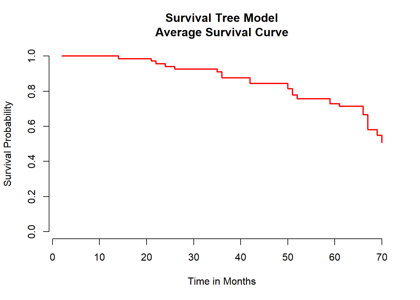
To visualize the survival tree there are severl way to do that. We can fro example plot the survival function for each study participant but that us usually not giving out any extra information. Therefore, the best and easiest way is to plot the averaged survival functiona s shown above.
Comparison Plot Whenever we have severl models we can compare them. A really useful way to do that is via a comparison plot.
# Set up dataframe for Kaplan_Meier
mykm1 <- survfit(Surv(time, status) ~ 1, data=prost) # KM model

kmdf <- data.frame(mykm1$time,
                   mykm1$surv,
                   KM = rep("KM", 36)) # mark as KM in the third column

names(kmdf) <- c("Time in Months", "Survival Probability", "Model")

# Set up dataframe for Cox Proportional Hazards
cox <- coxph(Surv(time, status) ~ treatment + age + sh + size + index, data =prost) # Cox PH model
coxfit <- survfit(cox)


coxdf <- data.frame(coxfit$time,
                    coxfit$surv,
                    COX = rep("COX", 36))

names(coxdf) <- c("Time in Months", "Survival Probability", "Model")

# Set up dataframe for Random Forest
rfdf <- data.frame(death_times,
                   avg_prob,
                   RF = rep("RF", 36))

names(rfdf) <- c("Time in Months", "Survival Probability", "Model")

# Bind dataframes
plotdf <- rbind(kmdf, coxdf, rfdf)

# Plot
library(ggplot2)
p <- ggplot(plotdf, aes(x = plotdf[,1],      # event time in months
                        y = plotdf[,2],      # survival probability
                        color = plotdf[,3])) # model type

p + geom_step(size = 1.5) +
  labs(x = "Time in Months",
       y = "Survival Probability",
       color = "",
       title = "Comparison Plot of\n3 Main Survival Models") +
       theme(plot.title = element_text(hjust = 0.5))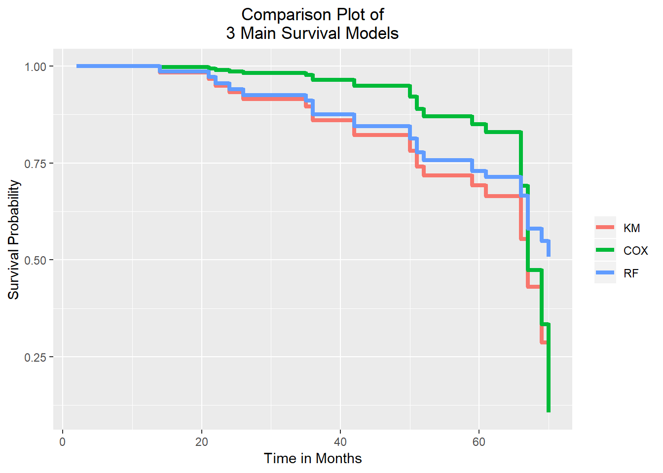
From the graph above, we can see three step lines for each model. The time in months pn the x-axis and the probability of survival on the y-axis. We have a high survival probability up until months 50 and this is simila in each of the three models. After this period, we see a significant drop in survival. Moreover, after about 65 months the survival goes down dramatically. The Random Forest is somewhere in the middle of these models and stops at the survival probability of 50 percent. This means that the Random Forest model has the most positive outlook for this study end point. On the contrary, the Cox Proportional Hazard model shows the most negative outlook for that time point. Last but not least, we should not fotget that the survival tree comes to its full potential with huge data set. We also have to consider that the Kaplan-Meier curve does not take covariance into consideration, whereas the Cox Proportional Hazards includes the covariates. Therefore, it is likely in many scenarios the Cox Proportional Hazards model is more accurate.