Process Data Event data consists of three basic components: the why, the what and the who. Analysing event data is an iteractive process of three steps: extraction (from raw data to event log), processing (removing redundant details, enrich data by calculating variables) and analysis. The analysis could be for instance which are the roles of different doctors and nurses organization and how they work together. There is also in the analysis the controll-flow prospective (e.g. what is the journey of a patient throughthe emergency rooms). Finally, the performance prospective, focus on the time and efficiency (e.g. how long does it take before a patient can leave the emergency rooms).
A first glimpse of the event log Some initial question about event log are: How many cases are described? How many distinct activities are performed? How many events are recorded? What is the time period in which the data is recorded?
To analys the process data, we use the bupaR package. In the following exercise we will have a look at a process data, which descries the journey of patients in a hospital.
library(bupaR)
# n_cases(patients) # how many patients
# summary(patients)
slice(patients, 1) # show the first patient
Log of 12 events consisting of:
1 trace
1 case
6 instances of 6 activities
6 resources
Events occurred from 2017-01-02 11:41:53 until 2017-01-09 19:45:45
Variables were mapped as follows:
Case identifier: patient
Activity identifier: handling
Resource identifier: employee
Activity instance identifier: handling_id
Timestamp: time
Lifecycle transition: registration_type
# A tibble: 12 x 7
handling patient employee handling_id registration_ty~
<fct> <chr> <fct> <chr> <fct>
1 Registr~ 1 r1 1 start
2 Triage ~ 1 r2 501 start
3 Blood t~ 1 r3 1001 start
4 MRI SCAN 1 r4 1238 start
5 Discuss~ 1 r6 1735 start
6 Check-o~ 1 r7 2230 start
7 Registr~ 1 r1 1 complete
8 Triage ~ 1 r2 501 complete
9 Blood t~ 1 r3 1001 complete
10 MRI SCAN 1 r4 1238 complete
11 Discuss~ 1 r6 1735 complete
12 Check-o~ 1 r7 2230 complete
# ... with 2 more variables: time <dttm>, .order <int>As shown above, the first patient went through six events: registration, triage, blood tests, an MRI scan, discussion of results, and check out, over the course of a week in January 2017.
Here below, we see that the most common activities are administrative: registration (18.4%), triage (18.4%), discussing results (18.2%), and checking out (18.1%).
activities(patients)# A tibble: 7 x 3
handling absolute_frequency relative_frequency
<fct> <int> <dbl>
1 Registration 500 0.184
2 Triage and Assessment 500 0.184
3 Discuss Results 495 0.182
4 Check-out 492 0.181
5 X-Ray 261 0.0959
6 Blood test 237 0.0871
7 MRI SCAN 236 0.0867The sequence of activities performed in relation to one case is called its trace, literally the trace that the process instance leaves in our data. The trace plot here below, shows two happy paths ( most frequebt sequences: 51.6% and 46.8% of cases). They start with registration and triage, then have one or more treatments, then end with discussion of results and check-out.
library(processmapR)
trace_explorer(patients, coverage = 1)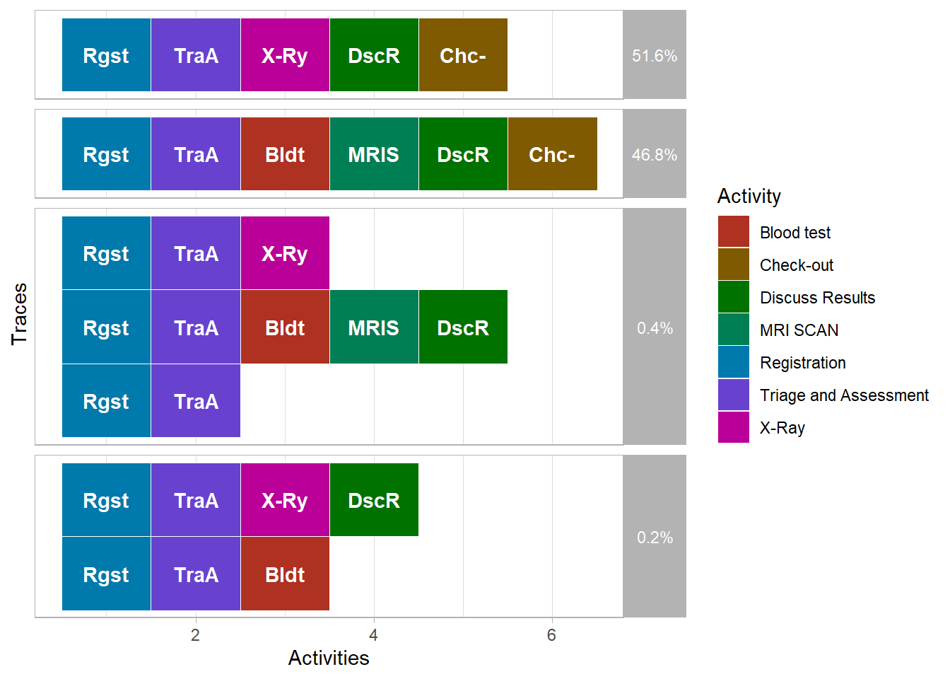
Another way to visualize processes is by constructing a process map. A process map is a directed graph that shows the activities of the process and the flows between them. The colors of the nodes and the thickness of the arrows indicate the most frequent activities and process flows.
process_map(patients) # draw the process mapResource activity matrix The nest step is to look at the activities. In the resource activity matrix we put different resources on one dimention and the activities on the other dimension. In the following example, we will look at the employees working in a hospital which are treating patients with Sepsis, a life-threatening condition caused by an infection. Treating these patients is of the utmost importance. Let’s see how tasks are divided.
# Calculate frequency of resources
frequencies_of_resources <- resource_frequency(sepsis, level = "resource-activity")

# See the result as a plot
# plot(frequencies_of_resources)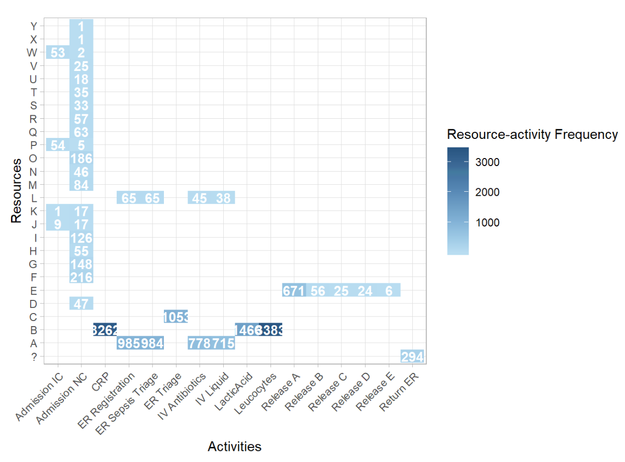
In the plot above, we can see which resources executed which activities, and how often. Resources F,G,I,M and O have the same task; they are responsible for the activity Admission NC. Momreover, the most common combination was Resource B performing the Leucocytes activity. Let’s see what this information tells us about the employees of the hospital. Another thing that can be measured is their involvement. Involvement refers to the number of cases a resource works on, irrespective of his/her total workload.
# Calculate resource involvement
involvement_of_resources <- resource_involvement(sepsis, level = "resource")

# Show the result in a plot
plot(involvement_of_resources)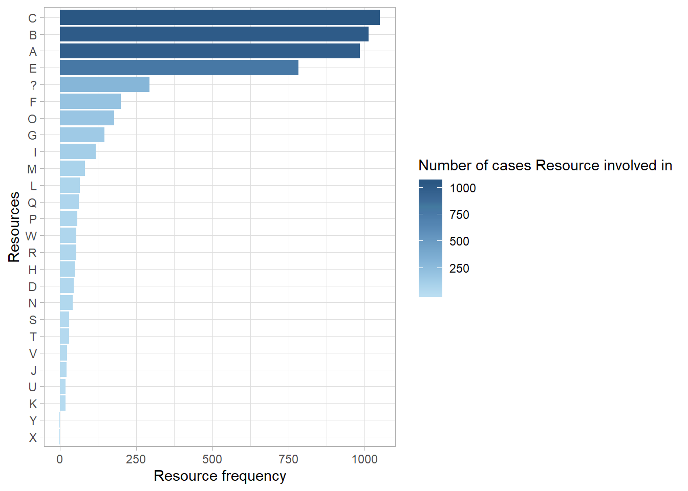
Control Flow It refers to the different successiones of activities. Each case can be expressed as a sequence of activities. Each unique sequence is called a trace (or process variant). There are several ways to look at a trace in a process. On the one hand, we have metrics (enty and exit poin, lengh of cases, presence of activities, rework). On the other hand, we have various tools to look at control-flow patterns (process map, trace explorer, precedence matrix).
Rework When looking at the structure of a process, an interesting aspect to look at is rework. Rework happens when the same activity is repeated within a single case, which often points towards time and resources which are wasted, and typically a mistake which has to be rectified. We can distinguish between two different types of rework: immediate rework, we are also known as self-loops of activities, and rework which surfaces later in the process, which we call repetitions.
# Number of repetitions per activity
n_reps_per_activity <- number_of_repetitions(sepsis, level = "activity")

# See the result in a plot
plot(n_reps_per_activity)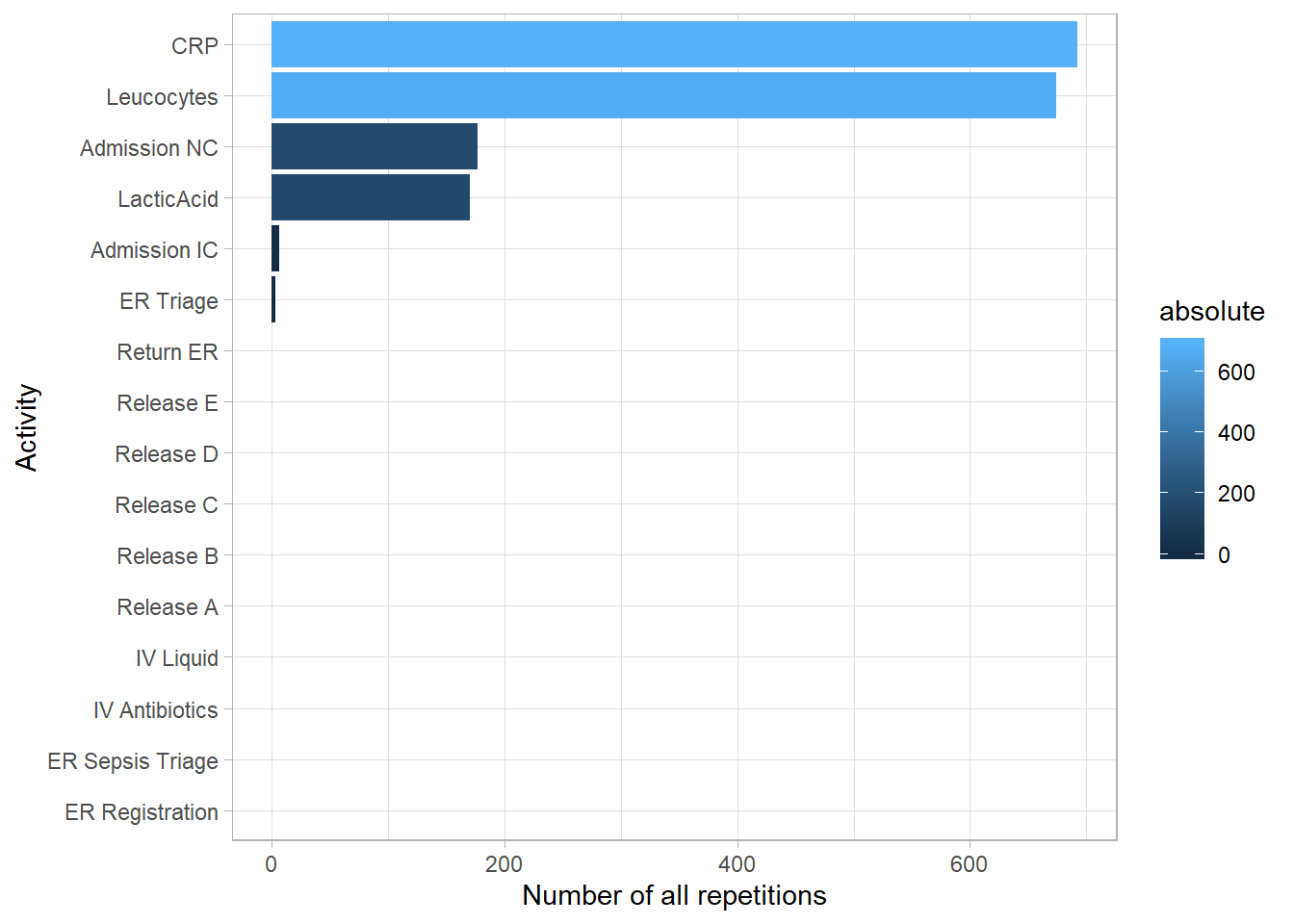
The CRP activity was repeated more than any other activity type, followed by Leucocytes and Admission NC.
Performance Analysis The performance process map is a special type of process map which does not show frequencies on the arcs and nodes, but duration, both of activities and the times between activities. Another specific technique related to time is the Dotted Chart. While the performance process map focusses n the duration of the activities, the dotted chart shows the ditribution of activities over time. The dotted chart is essentially a scaterplot of activity instances each occuring at a specific time (x-axis) and belong to a specific case (y-axis). Specific patterns can be observed.
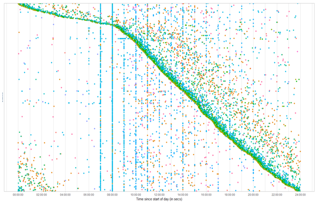
The dotted chart above, shows the distribution of activities over time: it shows an activity that occurs in a specific time (x-axis), and belong to a specific case (y-axis). The dense sloped line of activities emerges because of the sorting, and shows that starting at 8am in the morning, there suddenly much more cases appearing compared to the night time. Furthermore, we see a set of vertical lines consisting of the same activity type, which is represented by the color of the points. This means that these activities always occur at regular intervals: 7am, 8am, 9am, 10am. After 10am, these lines fade away, although not comletely vanished.