A lot of the times when dashboards are implemented they are with a very specific dataset. The problem with this is that we have to rebuild them from scratch every time. The advantage to use shiny is the possibility to create interactive dashboard or webapp without, and reusing the code already wirtten we can adapt it with new data. Here below, there are some examples of interactive dashboards.
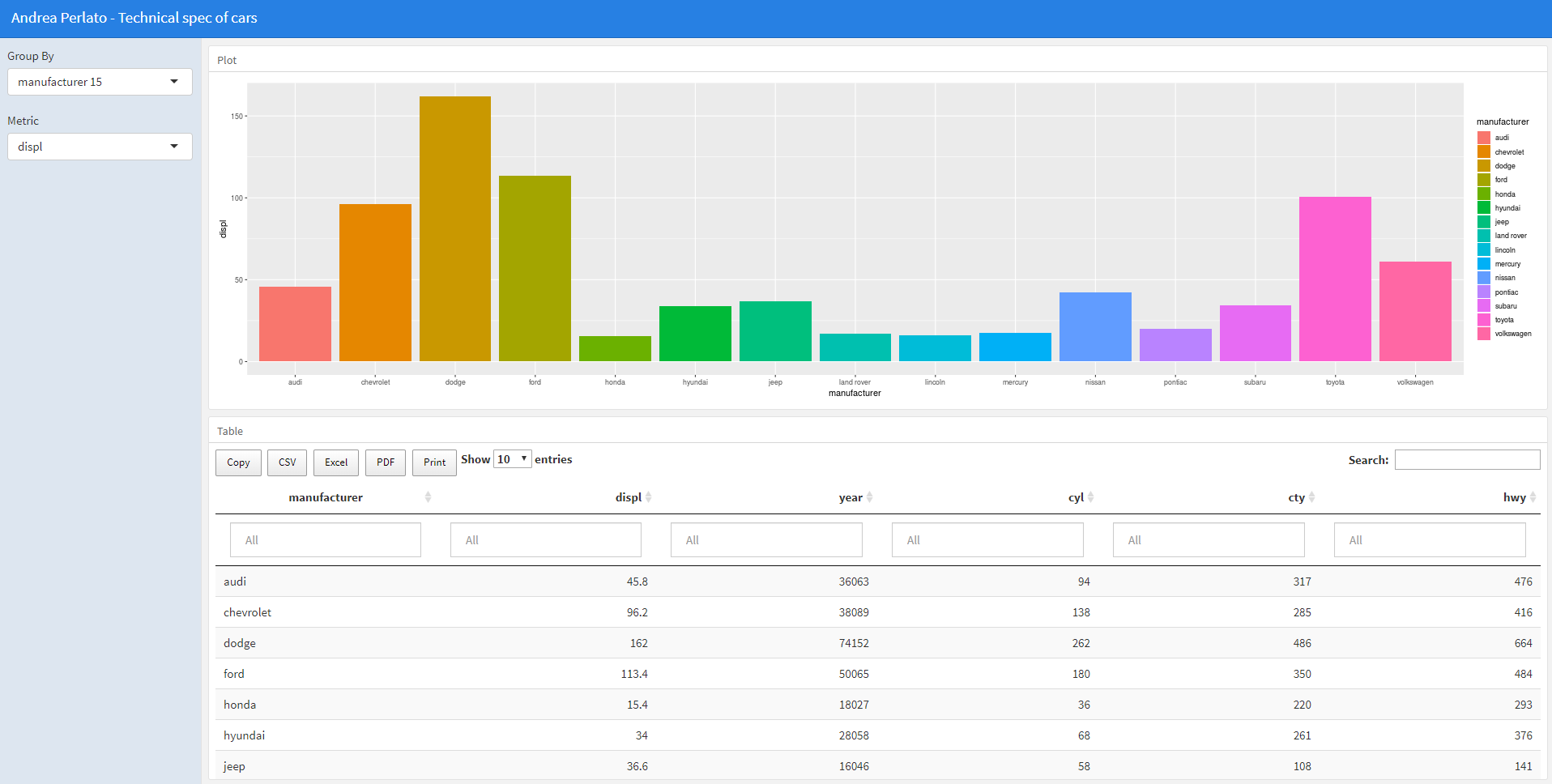
Technical spec of cars In this example we have a dropdown menu on the left dynamically populated from the data. For each feature inside the dropdown mnu we have the count of the unique values per each features. with have also a second dropdown menu where we can choose between three types of metrics (height, mass, birth_year). At the bottom of the dashboard we have a data table, where we can use a filter by specific columns. The dataset used is mpg, which is technical spec of cars like: car manufacturer, model name, engine displacement in liters, year of manufacturing, number of cylinders, type of transmission, drive type, city mileage (miles per gallon), highway mileage (miles per gallon), fuel type. Click on the image below or here to see the dashboard in action.
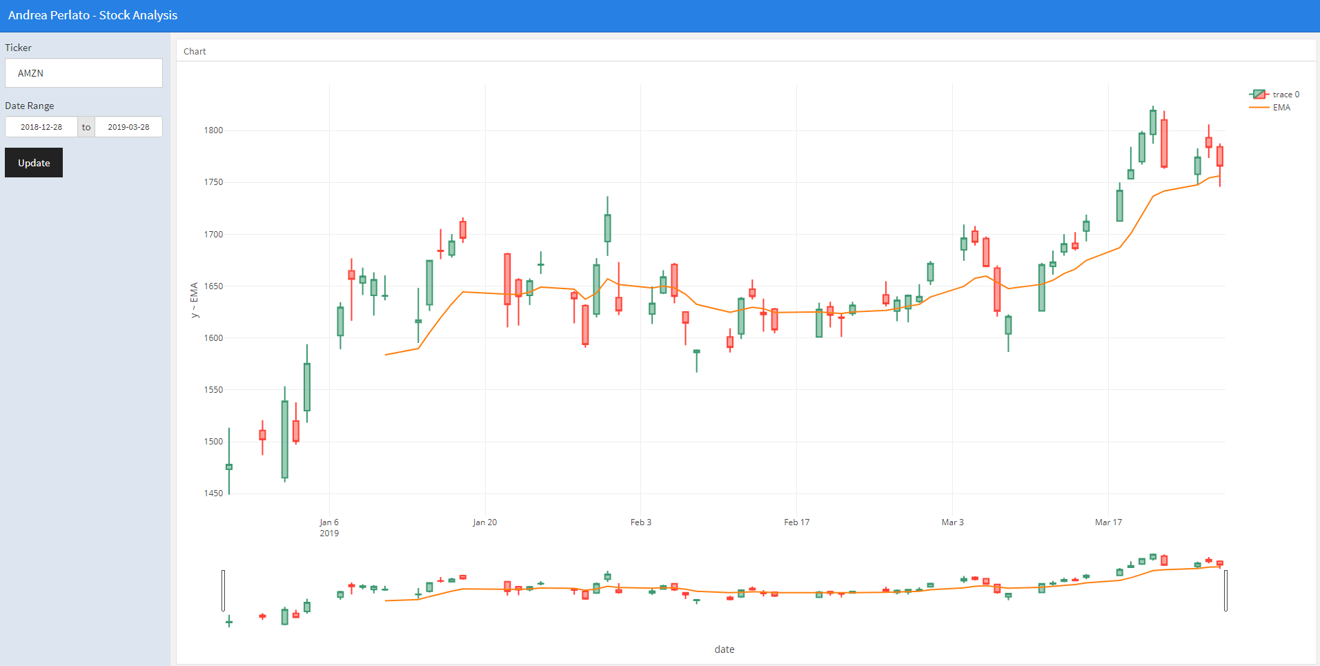
Stock Charts and Time Series This analysis technique presented in a interactive fashion can be applied to any time series. The benefit of carrying out finantial and time series analysis is that we can simultaneously analyze entire portfolios and markets of stocks using all the rich analysis features of the interactive dashboard. This dashboard represent the last 90 days of stock price with candlestick representation, EMA Exponential Moving Average overimposed. We can switch from AMZN Amazonto MSFT Microsoft, and many others stock prices. Click on the image below or here to see the dashboard in action.