Graphs are a common method to visually illustrate relationships in the data,and they give a clear and compact idea and knowledge of matter contained in, at first sight. Graphs are extremely important and in data analysis they are considered the first statistics to perform. In this post we descrie the R package gganimate an extension of the ggplot2 package for creating animated ggplots. It provides a range of new functionality that can be added to the plot object in order to customize how it should change with time. The key features of gganimate are: 1 - transitions: data to change 2 - views: viewpoint to change 3 - shadows: nimation to have memory We use as an example the gapminder data set.
# A tibble: 6 x 6
country continent year lifeExp pop gdpPercap
<fct> <fct> <int> <dbl> <int> <dbl>
1 Afghanistan Asia 1952 28.8 8425333 779.
2 Afghanistan Asia 1957 30.3 9240934 821.
3 Afghanistan Asia 1962 32.0 10267083 853.
4 Afghanistan Asia 1967 34.0 11537966 836.
5 Afghanistan Asia 1972 36.1 13079460 740.
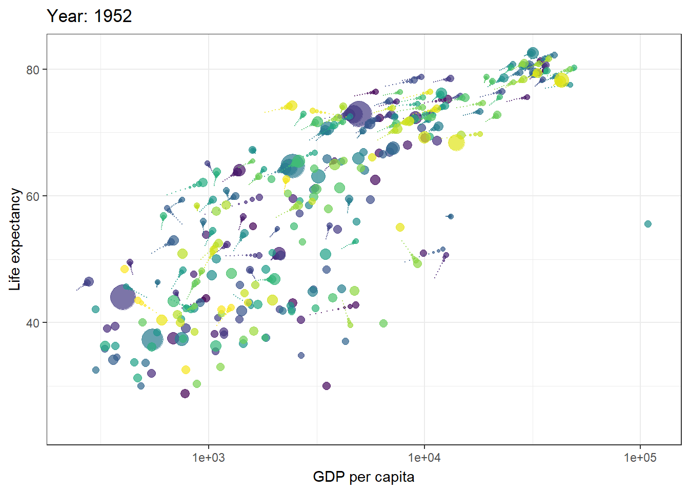
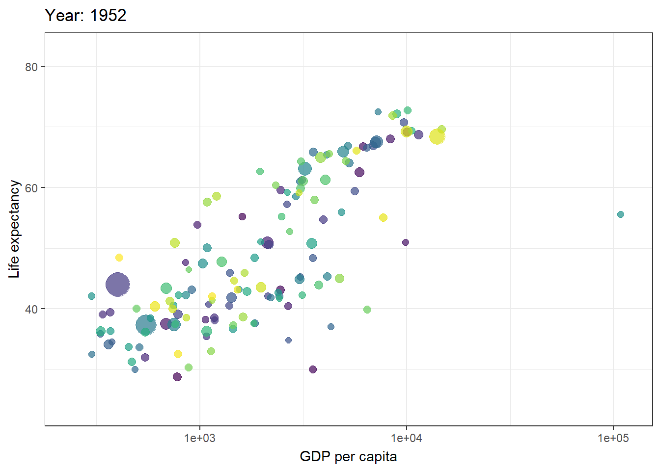
6 Afghanistan Asia 1977 38.4 14880372 786.First example is the relationship between the Life Expectancy as a function of Gross Domestic Product per capita. The animation present the disctict states in time using the function transition_time(). The transition length between the states will be set to correspond to the actual time difference between them.
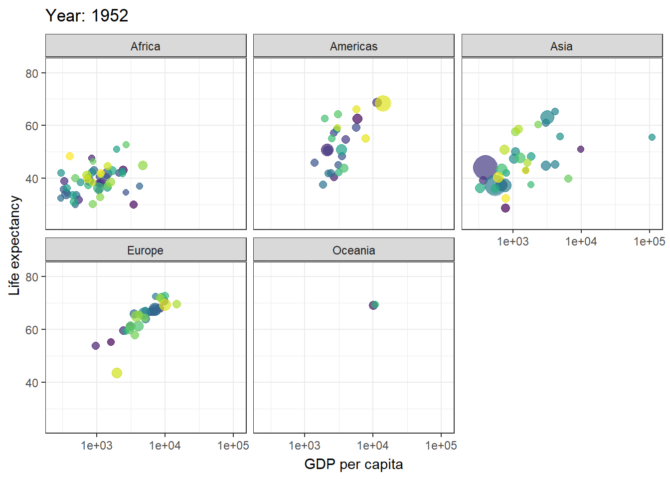
We can also create facets by continent.
Moreover, we can show preceding frames with gradual falloff. This shadow is meant to draw a small wake after data by showing the latest frames up to the current. We can choose to gradually diminish the size and/or opacity of the shadow. The length of the wake is not given in absolute frames as that would make the animation susceptible to changes in the framerate. Instead it is given as a proportion of the total length of the animation.