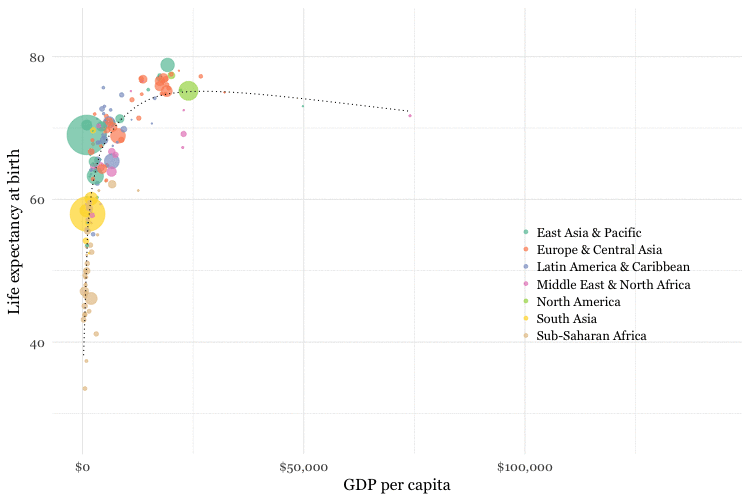
We used the data from the World Bank Indicators Portal which is an incredibly rich resource to make an animation of the Life Expectancy as a function of Gross Domestic Product per capita. More precisely, this is the value of all final goods and services produced within a nation in a given year, converted at market exchange rates to current U.S. dollars, divided by the average population for the same year.
All the points in the graph moved smoothly, rather than jolting from year to year. It is possible to achieve this effect, using an R package called tweenr, which can interpolate data provide the missing values for an animation with more frames.
Now let’s see the code to generate this animated graph.
First we have to prepare our data and define the acceleration of the graphucal animation.
# Prepare nations data
nations_edit <- nations %>%
  arrange(country, year) %>%
  select(gdp_percap,life_expect,year,country) %>%
  rename(x=gdp_percap,y=life_expect,time=year,id=country) %>%
  mutate(ease="linear") # define acceleration of the animation

# Use tween
nations_tween <- tween_elements(nations_edit, "time", "id", "ease", nframes = 300)

# Create year and country fields, for join
nations_tween <- nations_tween %>%
  mutate(year = round(time),
         country = .group)

# Join
nations_tween <- inner_join(nations_tween,nations)
The function tween_elements() used above creates new variables called .frame, one for each of the specified number of frames, and .group, which corresponds to the id in the previous data frame, in our case the country names. It calculates new x, y, and time values for each frame. Now we can make the animated chart using gganimate.
# Make animated chart
nations_tween_chart <- ggplot(nations_tween, aes(x = x, y = y, frame = .frame)) +
  xlab("GDP per capita") +
  ylab("Life expectancy at birth") +
  theme_minimal(base_size = 16, base_family = "Georgia") +
  geom_point(aes(size = population, color = region), alpha = 0.7) +
  scale_size_area(guide = FALSE, max_size = 20) +
  scale_x_continuous(labels = dollar) +
  scale_color_brewer(name = "", palette = "Set2") +
  theme(legend.position=c(0.8,0.4))


# Run in the viewer
# gg_animate(nations_tween_chart, title_frame = FALSE, interval = 0.05)