Interactive Network is incredibly useful for visualizing the connections and relatioship between individuals, locations, and other data sets.
library("tidyverse")
library("leaflet")
# library("oidnChaRts")

transport_data <- read_csv("C:/07 - R Website/dataset/Graph/transport_data.csv")

colnames(transport_data) <- colnames(transport_data) %>%
  gsub("sender", "start", .) %>%
  gsub("receiver", "end", .)

transport_data <- transport_data %>%
  unite(start.location, c(start.country, start.city, start.state)) %>%
  unite(end.location, c(end.country, end.city, end.state))


# transport_data %>%
#   geo_lines_plot()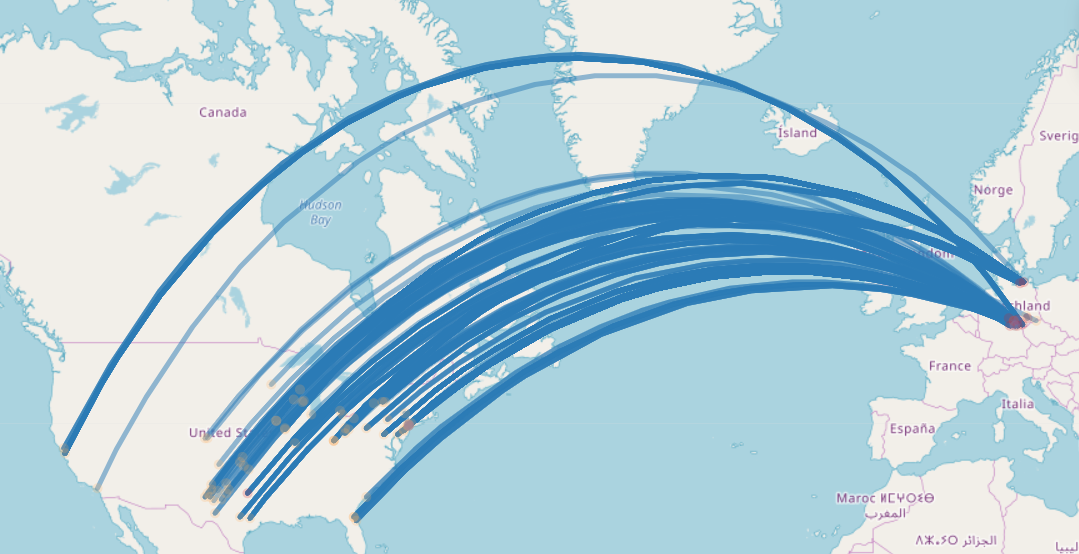
The map above shows the number of locations on the globe with lines between them and there are both, start and end points. This represent the number of journeys between Europe and United States of America. Displaying the data in this way doesn’t really provide us with a tangible understanding of which locations are linked with which. Be better understand this kind of data, we should re-represent the data as a graph and then a network visualization. This help us to understand the connectiveness of the data.
library("tidyverse")
library("visNetwork")

map_nodes <- read_csv("C:/07 - R Website/dataset/Graph/nodes.csv")
map_edges <- read_csv("C:/07 - R Website/dataset/Graph/edges.csv")


map_nodes <- map_nodes %>%
  mutate(id = row_number()) %>%
  mutate(title = location,
         label = city) %>%
  select(id, everything())

map_edges <- map_edges %>%
  mutate(from = plyr::mapvalues(send.location, from = map_nodes$location, to = map_nodes$id),
         to = plyr::mapvalues(receive.location, from = map_nodes$location, to = map_nodes$id)) %>%
  select(from, to, everything())


map_edges <- map_edges %>%
  mutate(width = weight / 3)


map_nodes <- map_nodes %>%
  mutate(color = plyr::mapvalues(country,
                                 from = c("USA", "DEU"),
                                 to = c("green", "blue")))


visNetwork(nodes = map_nodes, edges = map_edges) %>%
  visEdges(arrows = "middle")
The Network represented above is an initial representation of node and edges of the journeys between Europe and USA. We realize that we have not a fully connected network. It is not possible to move from any one location to any other location on the map. Zooming inside the newtok is possible to see the name of the cities. Moreover, when we hover the node, the can see the nation related to that city. The arrow show the direction of trabel between the nodes (cities). We have also colored the nodes based on the nation (USA vs, DEU), and we alsosclaed the width of the edges by the number of journeys taken between pairs of locations.
Now, we visualize people involved in the network. We color nodes based on the culture of people.
library("tidyverse")
library("visNetwork")

got_nodes <- read_csv("C:/07 - R Website/dataset/Graph/GoT_nodes.csv")
got_edges <- read_csv("C:/07 - R Website/dataset/Graph/GoT_edges.csv")

got_nodes <- got_nodes %>%
  mutate(group = superculture)

visNetwork(got_nodes,
           got_edges) %>%
  visIgraphLayout() %>%
  visGroups(groupname = "Unknown Culture",
            color= "green") %>%
  visGroups(groupname = "Northmen",
            color= "purple") %>%
  visLegend(useGroups = FALSE,
            addNodes = list(
              list(
                label = "Unknown Culture",
                color= "green"),
              list(
                label = "Northmen",
                color= "purple")
            ))
As we can see, there is a strog relationship between the Unknown and Northmen culture. This allow us to assume some sort of similarity between these two cultures.