In this post we are going to create interactive graphs using Plotly. Plotly allows us to create interactive charts, plot and maps with R. Plotly is designed to build a vast range of visualizations. Crucially, it has the ability to automatically create interactive charts from the output ggplot2 which is the most abvanced R library to create scientific graphs. Plotly has a wide range of onscreen tools: zoom is on by default, as are tools for panning and moving around in a chart. There are even context-aware tools for lassoring selecting points. All of these interactions can be detected and utilized within a Shiny web app. Plolty does focus on a scientific and technical audience, providing a wide range of statistical charts.
Plotly has the ability to automatically convert a wide range of ggplot2 chatrs into interactive Plotly chart with almost no effort at all. Let’s start with a static chart here below.
library(tidyverse)
load("C:/07 - R Website/dataset/Graph/british_weather.rdata")

gg_weather <- british_weather %>%
  mutate(tdiff = tmax - tmin) %>%
  group_by(region, mm) %>%
  dplyr::summarise(average.tdiff = mean(tdiff, na.rm = TRUE)) %>%
  ungroup() %>%
  ggplot(aes(
    x = mm,
    y = average.tdiff,
    group = region,
    col = region,
    text =paste0("UK (", region, ")")
  )) +
  geom_line() +
  geom_point() +
  labs(x = "Month", y = "Mean daily temperature difference") +
  ggtitle("Mean daily temperature difference in the UK", subtitle = "Split by region")

gg_weather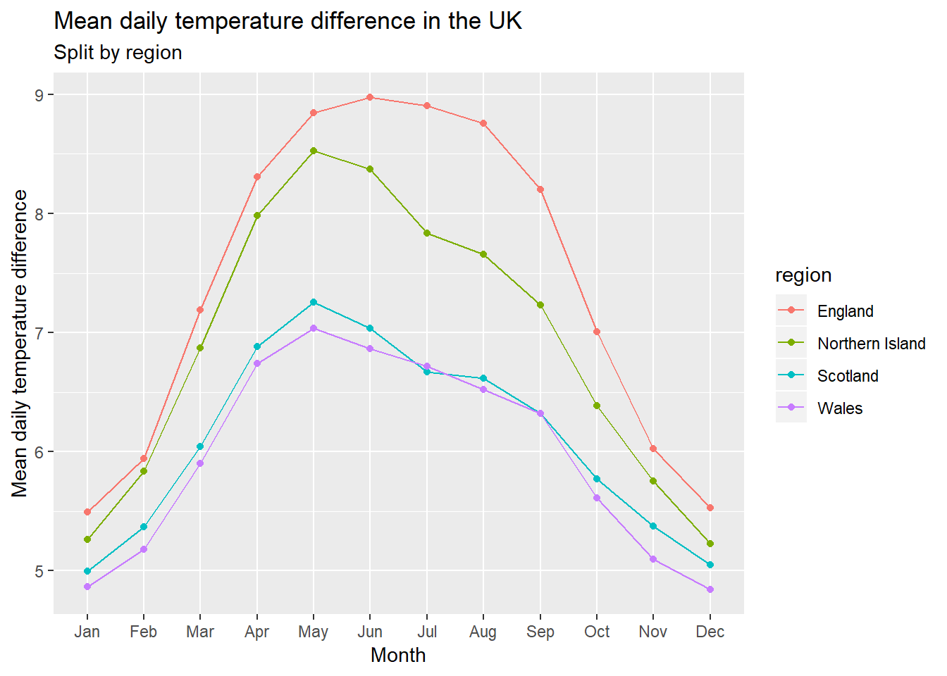
Here above, we have a nice attractive looking static ggplot2 output. We have a scatterplot with X axis that labels months and Y axis that labels mean daily temperature differences. Now, we can hand this ggplot2 object over to plotly to make it interactive.
library(plotly)
gg_weather %>%
  ggplotly(tooltip = c("x", "y", "text"))
The graph above is an intecative version of the chart. The chart looks much the same as the static ggplot, but as we hover the cursor over the markers in the plot, we have a tooltip now, showing the month and the average temperature difference for that month.
Most of the geom() functions available in ggplot2 can be converted to plotly charts. For instance, boxplots as we can see fromt he chart below.
gg_boxplot <- british_weather %>%
  mutate(tdiff = tmax - tmin) %>%
  group_by(region, mm) %>%
  ggplot(aes(
    x = region,
    y = tdiff,
    fill = region
  )) + geom_boxplot()

ggplotly(gg_boxplot)
When we hover the cursor over the boxplot we get information about the quantiles and the median as well. We can also appreciate the exact value of the outliers.
A very useful method to better understand the distribution of our datta is the jittering to avoid overplotting.
df <- data.frame(x = sample(LETTERS[1:10], size = 1000, replace = T),
                 y = sample(1:100, size = 1000, replace = T),
                 group = sample(letters[1:5], size = 1000, replace = T))


p <- ggplot(mtcars, aes(x = factor(gear), y = mpg, color = cyl)) +
  geom_boxplot() +
  geom_jitter(size = 2) +
  ggtitle("geom_jitter: boxplot")

p <- ggplotly(p)
p
Moreover, we can add some animation to the graph.
library(gapminder)

p <- ggplot(gapminder, aes(gdpPercap, lifeExp, color = continent)) +
  geom_point(aes(size = pop, frame = year, ids = country)) +
  scale_x_log10()

p <- ggplotly(p)
p
The graph above shows in a very fancy way, the relationship between Life Expenditure and Grosso Domestic Product as a function of Continents. We can see how the relationship varies over the period. We can also decide to exclude the observations of one or more continent.