I recently underwent to different tests of the so called Hair Analysis, and as a result I was given different conclusions. More precisely, I sent two of my hair samples to a two different labs, one in Italy and the second in Switzerland. The results are quite different as described by the table and graph below. In 2011 a comprehensive review was published of the scientific literature on hair elemental (mineral) analysis. It conclued that offering a diagnosis as to the cause of an abnormal concentration is currently not feasible and is difficult to see as realistic, for the entire article click here. Moreover, the AMA opposes chemical analysis of the hair as a determinant of the need for medical therapy and supports informing the American public and appropriate governmental agencies of this unproven practice and its potential for health care fraud. The result that I obtained from the Italian vs. the Swiss Lab confirm the dispute.
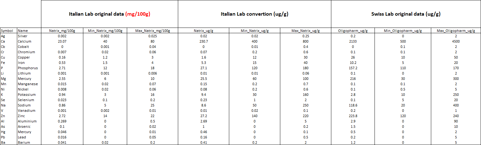
As we can see from the table above, it was necessary to convert the result of the Italin Lab from mg/100g to ug/g, in order to compare the Hair Analysis. What appears immediately clear is the diffent range of normality used. For example looking at the Mercury the levels are quite similar, but based on the range (look at Min, Max columns) for the Italian Lab I have a dangerus level of Mercury and a medical examinatin is recomended. On the contrary for the Swiss Lab the level of Mercury is normal and I do not need a medial advice.
A second very suspicius aspect is related to the leve of the natural trace elements. For example, the level of Calcium is ten times higher when examined in Swiss (Italian Lab: 230.7 ug/g, Swiss Lab: 2133 ug/g).
This strong discrepancy make also difficult to compare the results in a same comprehensive graph. The solution presented here, is to leave the y-axis free and convert the lines representing tics to a square root or cube root.
# Load data
df <- read.csv("C:/07 - R Website/dataset/Graph/Natrix_vs_Oligopharm.csv", sep=";")

# Create a functin for cube root
cuberoot_trans = function() trans_new('cuberoot',
                                      transform = function(x) x^(1/4),
                                      inverse = function(x) x^4)

# Define the plot
library(ggpubr)
library(scales)
p <- ggdotchart(df, x = "Symbol", y ="Value",
                color = "Origin",
                palette = c("red","grey", "grey", "red","grey", "grey"),
                size = 3,
                add = "segment",
                add.params = list(color = "lightgray", size = 1.5),
                # position = position_dodge(0.5),
                ggtheme = theme_gray()
                )

p <- p + theme(axis.text.x = element_text(angle = 0, hjust = 1))
p <- p + theme(legend.position="bottom")
p <- p + scale_y_continuous(trans = cuberoot_trans())
p <- facet(p, facet.by = "Lab", scales="free_y")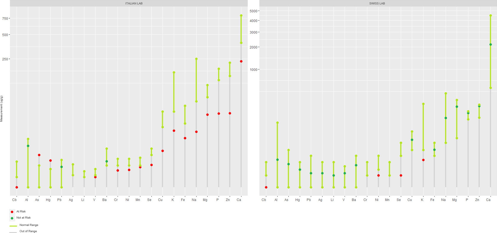
Now, the results from the two labs are comparable. It is evident here that for the vast majority of natural elements the Italian lab gives a more severe result as opposed to the Swiss Lab. The massive deficiency of natual elements highlighted in Italy is contradicted by the analyses made in Switzerland. In addition to this, the use of different ranges of tolerances for heavy metals such as Mercury in different countries is disappointing.
At present, both labs are not able to give me one possible explanation, but stay tuned for updates.