Most statistical methods assume that you’re working with complete matrices, vectors, and data frames. In most cases, we have to eliminate missing data before we address the substantive questions that led us to collect the data. We can eliminate missing data by removing cases with missing data, or replacing missing data with reasonable substitute values. In either case, the end result is a dataset without missing values. Statisticians typically classify missing data into one of three types. These types are usually described in probabilistic terms, but the underlying ideas are straightforward. Missing completely at random. If the presence of missing data on a variable is unrelated to any other observed or unobserved variable, then the data are missing completely at random MCAR. Missing at random. If the presence of missing data on a variable is related to other observed variables but not to its own unobserved value, the data is missing at random MAR. Not missing at random. If the missing data for a variable is neither MCAR nor MAR, it is not missing at random NMAR. In this article we are going to use a graphical representation of missing data and a method to substitute the missing values using Python and R.
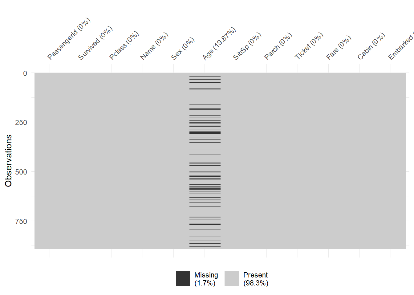
Performing exploratory data analysis we can find the presence of missing data. We can create a Heatmap in order to have abetter undestanding of the volume and distribution of our missing data.
miss = train.isnull()
miss.head()
## PassengerId Survived Pclass Name ... Ticket Fare Cabin Embarked
## 0 False False False False ... False False True False
## 1 False False False False ... False False False False
## 2 False False False False ... False False True False
## 3 False False False False ... False False False False
## 4 False False False False ... False False True False
##
## [5 rows x 12 columns]In the code above, we first transform our data in a shadow matrix, where False is not missing and True is missing. Based on this shadow matrix we can create an heatmap, and in this case we switch to R code using ggplot.
Now we switch back to Python to create a function impute_age that use the median values of Age as a function of the three levels of the passenger class Pclass (1, 2, 3) in order to replace missing values. So we are going to impute the median by Pclass to fill the missing values.
# calculate the Age median by Pclass
train.groupby('Pclass')['Age'].median()

# define the function
## Pclass
## 1 37.0
## 2 29.0
## 3 24.0
## Name: Age, dtype: float64def impute_age(cols):
Age = cols[0] # create an inxed for apply
Pclass = cols[1] # create an inxed for apply
if pd.isnull(Age):
if Pclass == 1:
return 37 # median of Pclass 1
elif Pclass == 2:
return 29 # median of Pclass 2
else:
return 24 # median of Pclass 3
else:
return Age
# pass the function to the dataset train
train['Age'] = train[['Age', 'Pclass']].apply(impute_age, axis=1) # axis = 1 means to apply to the column
In the code above, we created a function that takes an argument and checks if the Age is null; if not return the age value. In case the Age is null the function checks the Pclass and replace the null with the median age of that specific Pclass.